
margin塌陷问题及解决方案
margin塌陷问题
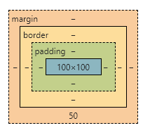
一、什么是margin塌陷?
在垂直方向如果有两个元素的外边距有相遇的,浏览器中加载的真正的外边距不是两个间距的加和,而是两个边距中值较大的,边距值小的塌陷到了边距值大的值内部,塌陷分为两种同级元素塌陷和父子元素塌陷
1.父子元素塌陷(外边距塌陷)
<style>
.outer {
width: 400px;
height: 400px;
background-color: gray;
}
.box1 {
width: 100px;
height: 100px;
background-color: orange;
/* 下面这行代码打开会引起margin塌陷 */
/* margin-top: 50px; */
}
.box2 {
width: 100px;
height: 100px;
background-color: green;
/* margin-bottom: 50px; */
}
</style>
</head>
<body>
<div class="outer">
<div class="box1">box1</div>
<div class="box2">box2</div>
</div>
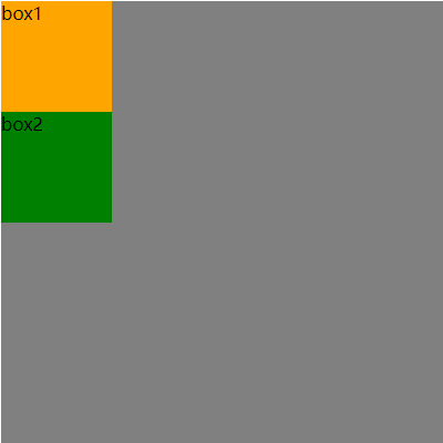
</body>使用以上代码可以得出正常的一个盒子模型,表现形式如下
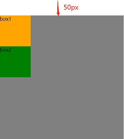
 当以上代码中的注释部分打开后,如
margin-top: 50px;,那么将会出现塌陷现象。从视觉上来看,就是box1的外边距强行将作为父元素的outer与自己绑定,在其顶部再多出一段50px的内容。本质上就是本身父元素与上一个元素的距离是0,子元素如果设置了垂直方向的上边距,那么此时子元素的上边距则塌陷至父元素中,两者一起移动
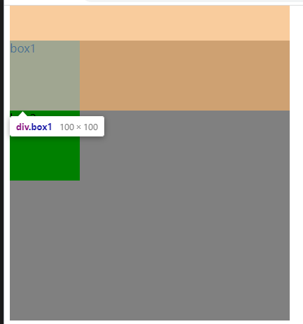

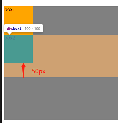
当margin-bottom: 50px被打开时,此时可以看到视觉上无明显移动,是因为outer作为父元素,而box2作为子元素,其外边距仍存在于父元素内部,所以box2的margin塌陷在了父元素outer的内部,可以理解为一个大的纸盒子中放了小纸盒子,小纸盒子你想象有一个透明的边框将其框住,但是总体因为小纸盒子加上你想象的透明的边框总大小仍小于大纸盒子,所以表现形式无任何改变
2.同级元素塌陷(外边距合并)
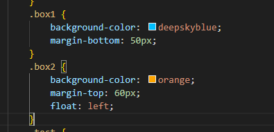
这种现象发生在两个并列的元素之间。给一个元素设置下外边距(margin-bottom),并同时给一个元素设置上外边距(margin-top)。两个元素之间的距离不等于这两个外边距之和,而是等于其中最大的一个外边距
    <style>
        .box {
            width: 200px;
            height: 200px;
        }
        .box1 {
            background-color: deepskyblue;
            margin-bottom: 50px;
        }
        .box2 {
            background-color: orange;
            margin-top: 60px;
        }
        .test {
            width: 200px;
            height: 200px;
            display: inline-block;
        }
        .testa {
            background-color: purple;
            margin-right: 50px;
        }
        .testb {
            background-color: tomato;
            margin-left: 50px;
        }
    </style>
</head>
<body>
    <div class="box box1">1</div>
    <div class="box box2">2</div>
    <!-- <hr>
    <div class="test testa">a</div><div class="test testb">b</div> -->
</body>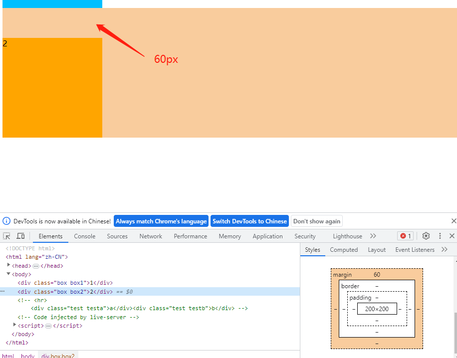
二、塌陷解决方法
1.外边距塌陷
第一种类型:给父元素设置外边框(border)或者内边距(padding)(不建议)
父元素加一个边框:
border: 1px solid;(影响盒子大小)父元素加内边距:
padding: 1px;(影响盒子大小)
第二种类型:触发BFC(推荐)
原理:BFC:Block Formatting Context,块级格式化上下文,BFC决定了元素对其内容定位,以及当前元素与其他元素之间的关系和相互作用。其目的就是形成一个独立的空间,让空间中的子元素不会影响到这个独立空间之外的布局。
父元素加上overflow属性
overflow: hidden;
2.外边距合并
一般遇到此情况不予处理,但仍可使用float: left;处理。注意,此方法会影响页面布局